I’ve been making a lot of excuses as to not share more photographs of my apartment – it’s too small, the lighting sucks (in this room’s case, it’s TRUE), it’s not “ready”…and so on.
And then I came to the realization that we’ll likely be in this apartment for just one more year. Â Hence, the “now or never” mentality on sharing pictures of our home.
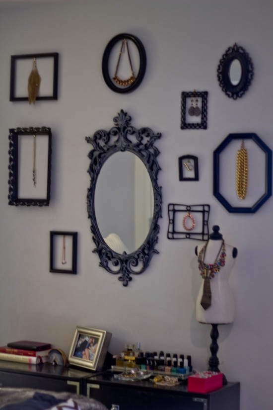
To kick things off, I’m sharing one of the three walls in our bedroom alcove - and the most interesting.  Recent Etsy shopping and Pinterest hoarding inspired me to “frame” my jewels in a gallery wall, converting two small Ikea chests into campaign dressers, and topping the dressers with some of my favorite books, beauty items, more jewelry, and a picture of my husband and I which never fails to bring a smile to my face.
I’d be lying if I said I collected these frames over time. Â I totally cheated and purchased the full set from this Etsy shop, and glued hangers to their backs.
I hung the frames around the mirror (also from Etsy, just search “vintage mirrors”), and hung the jewelry from the picture hooks.
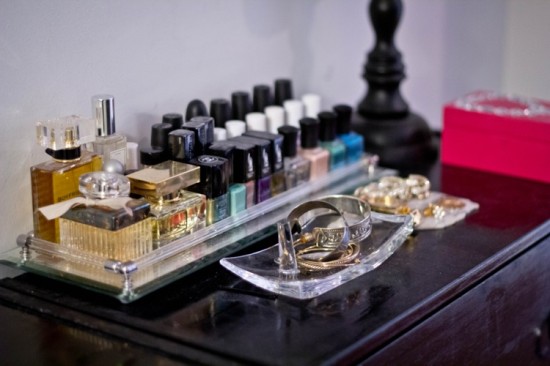
One of the dressers is topped by my items. Â I keep my favorite perfumes and nail colors on this tray, and arranged my favorite and regularly worn jewelry on various holders, a box I made at a BaubleBar event, and this jewelry bust.
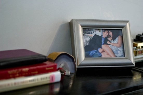
IÂ attempted to make this dresser’s top more masculine, with a much-loved frame photograph of us, a agate bookend that secures my phone charger, and a stack of books (topped by my Kindle, which I’m reading more often than not)
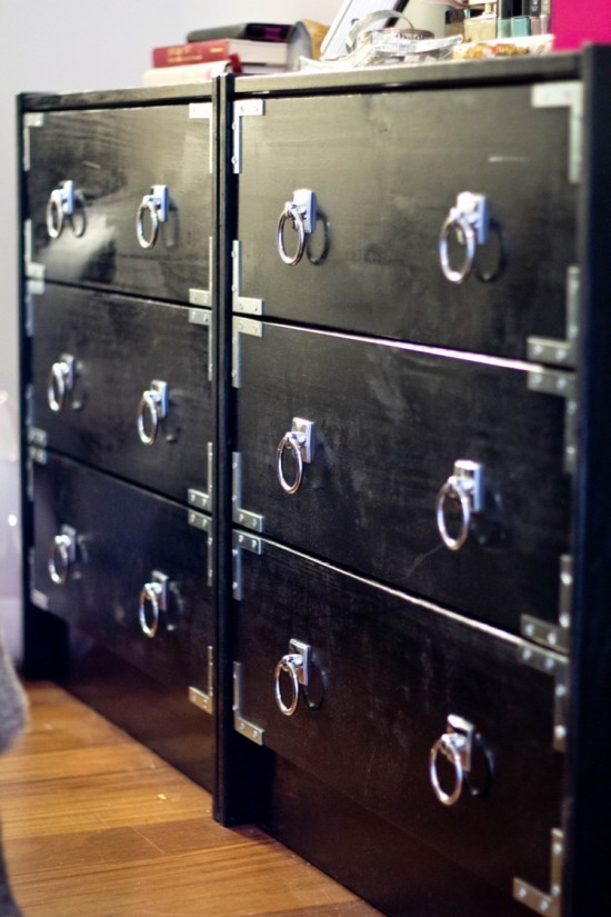
Using this tutorial, I converted two Ikea RAST nighstands into campaign style dressers. Â Props to Amazon – I was able to buy the EVERYTHING I needed for this DIY off the website. Â As we made these during a snowy NYC afternoon, not having to run out for supplies was much appreciated. Â Not being able to open windows while these suckers dried in our 500 square foot apartment – that was a bit tougher.
Here’s a look at our kitchen, if you’d like to see.
I’m not just using “the lighting sucks” excuse in the case of these pictures – it really is terrible, as the alcove is off the main hallway in our apartment and nowhere near a window. Â Great for sleep, terrible for photography. Â I hope you enjoyed this peek into our home – COMMENT below and let me know which other rooms you’d like to see.
